Adaptiva’s design system
Overview
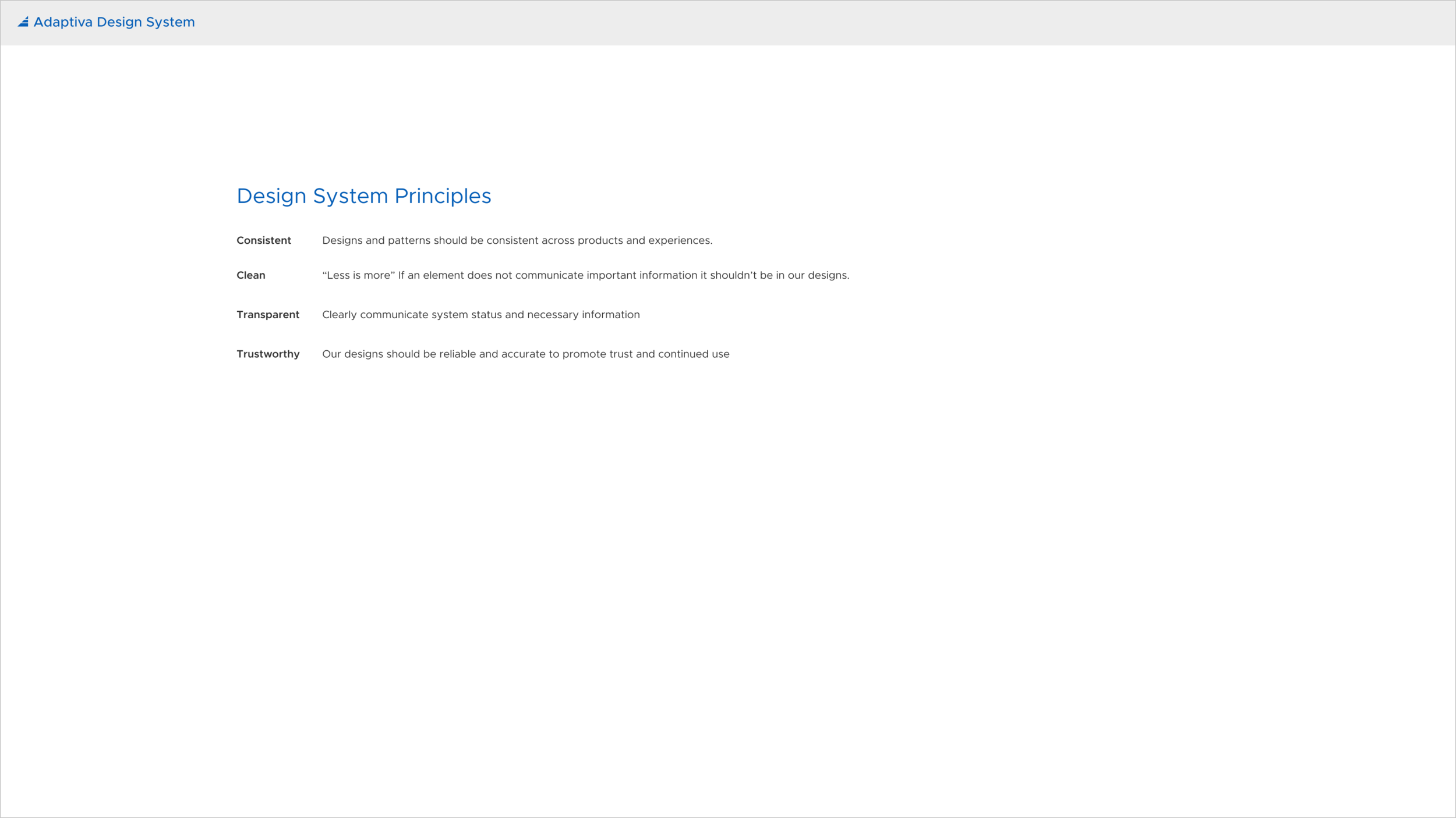
The Adaptiva web portal is Adaptiva's new web-based UI. I created and documented a design system consisting of design principles, design decisions for colors and typography, common experience patterns, and a style guide for a component library. The component library was passed onto engineering to create an internal tool to build screens. The development of this project was executed in four phases:
Background
Company
Adaptiva is a Kirkland, WA based company that provides endpoint management products for businesses to easily distribute content to and monitor compliance of endpoints.
Problem
This project came to life after designing my first project: Adaptiva's Evolve Vulnerability Management. During this time there were no Adaptiva-specific components and I learned that developers used another design system for components and styles. Because the components weren’t designed with Adaptiva’s use cases in mind there were limitations that prevented desired functionality. Additionally, it was difficult to provide an identity to the web portal without Adaptiva specific components.
Project goal
The goal of this project was to create a customized and cohesive design system for Adaptiva's web portal and document design decisions.
Role and responsibilities
As the only product designer at Adaptiva, I worked with product managers, engineers, and other stakeholders to see this project from concept to development. For this project, I designed a component library, wrote documentation, and collaborated with engineers during implementation. In addition to designs, I worked with engineers, product managers, the marketing team, and upper management to regularly gather feedback and understand values.
Process
Research
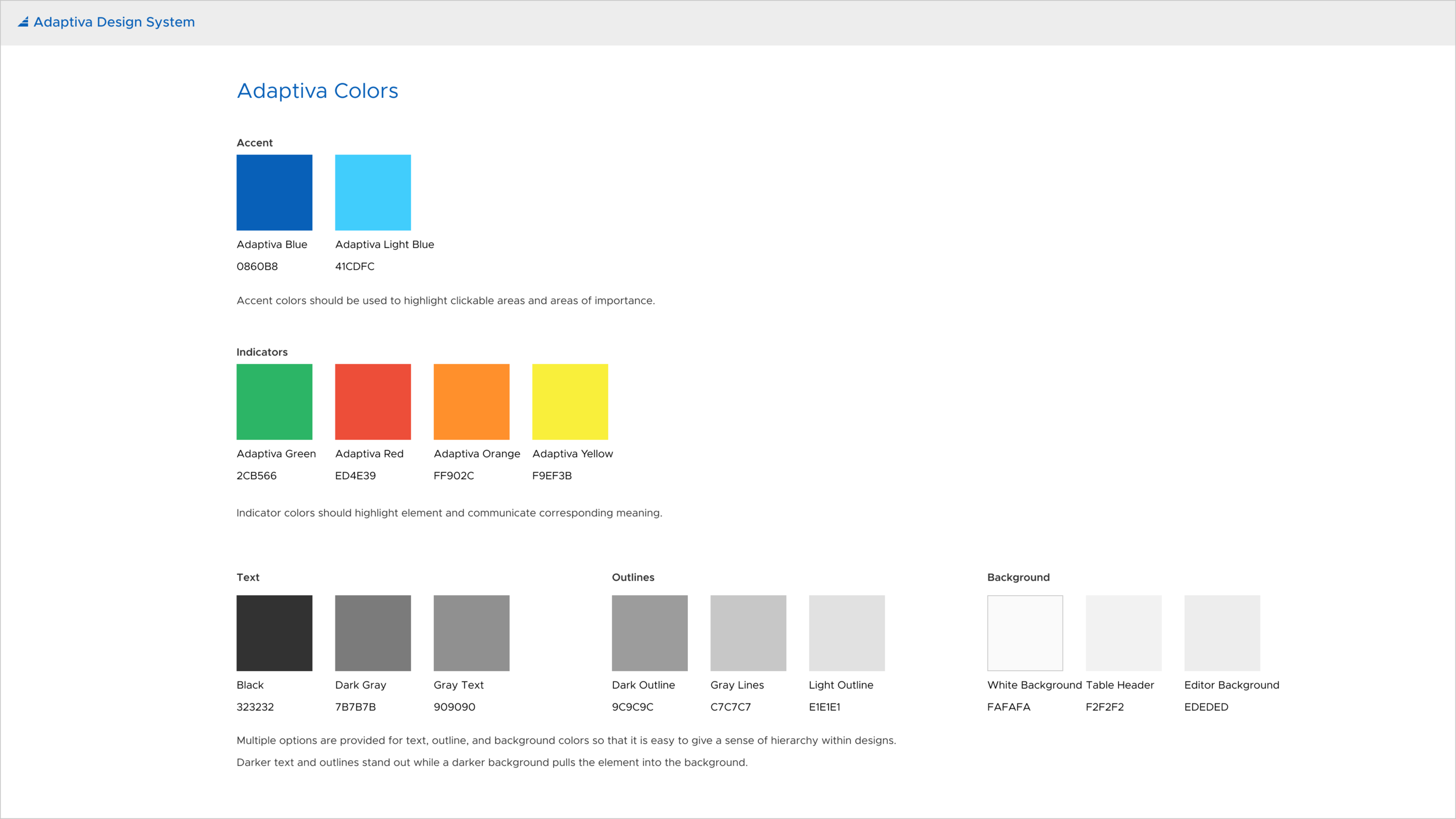
During my first project at Adaptiva to design a demo for Evolve Vulnerability Management, I used the Clarity Design System for visual components and ngx-charts for data visualizations. This initial project sparked the development of the Adaptiva design system. We lacked a visual designer, so I looked for other tools to alleviate some of the visual design load. These tools included ngx-charts for data visualizations and Font Awesome icons for common icons. Additionally, I used Clarity as the inspiration for many components in my design. For colors and styles, I worked with marketing to learn about branding and the Adaptiva colors used on the website.
Prototype
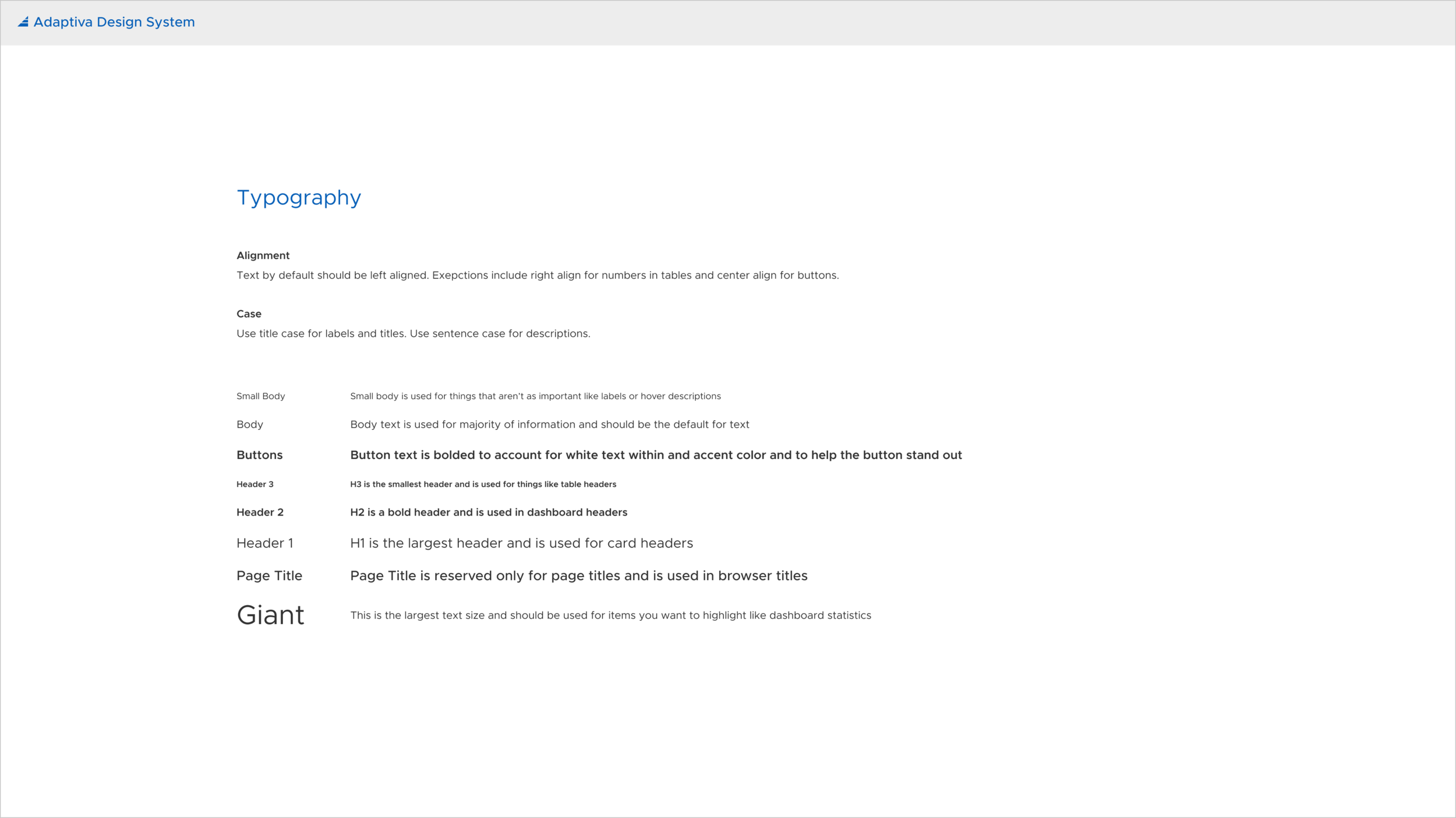
After defining design principles, I defined and documented rules for colors, typography, icons, and common components. I tried to adapt existing systems to fit Adaptiva's needs whenever possible. In the future, I would like to work with a visual designer to revise the design system and work with marketing to stay consistent with branding.
In addition to defining components, I identified common experience patterns throughout Adaptiva's products. As I took on more projects with different screen flows, I continued to add to this list. These experiences include flows for browsers, editors, dashboards, and settings. I often reference common patterns when brainstorming new features to products with stakeholders and plan to continue iterating to improve the experience flows.
Initially, the design system and documentation were created in Adobe XD, but I recently switched to Figma. Figma allows easy collaboration and I wanted to utilize this feature in anticipation of a growing design team. The design system and documentation are currently in my design file so that I can share the prototype link when it needs to be referenced. In the future, I would like to publish the design system outside of Figma so that it is easily accessible for everyone. In addition to design, it would also be useful to collaborate with engineers to include guidelines and implementation guidelines for developers within the design system.
Review
Throughout the process of creating components, I reviewed designs with engineers, product managers, and upper management to ensure feasibility, buy-in, and that the component library aligns with Adaptiva's goals. In the future, I would like to conduct usability tests with our customers to test components and common experience flows.
Engineering handoff
I worked with the front-end engineering team to implement designs and build a functional component library for Adaptiva’s UX designer, an internal tool to develop screens. We received positive feedback on the component library and plan to continue iterating.
Solution
The following are in-depth results of this project:
Style guide
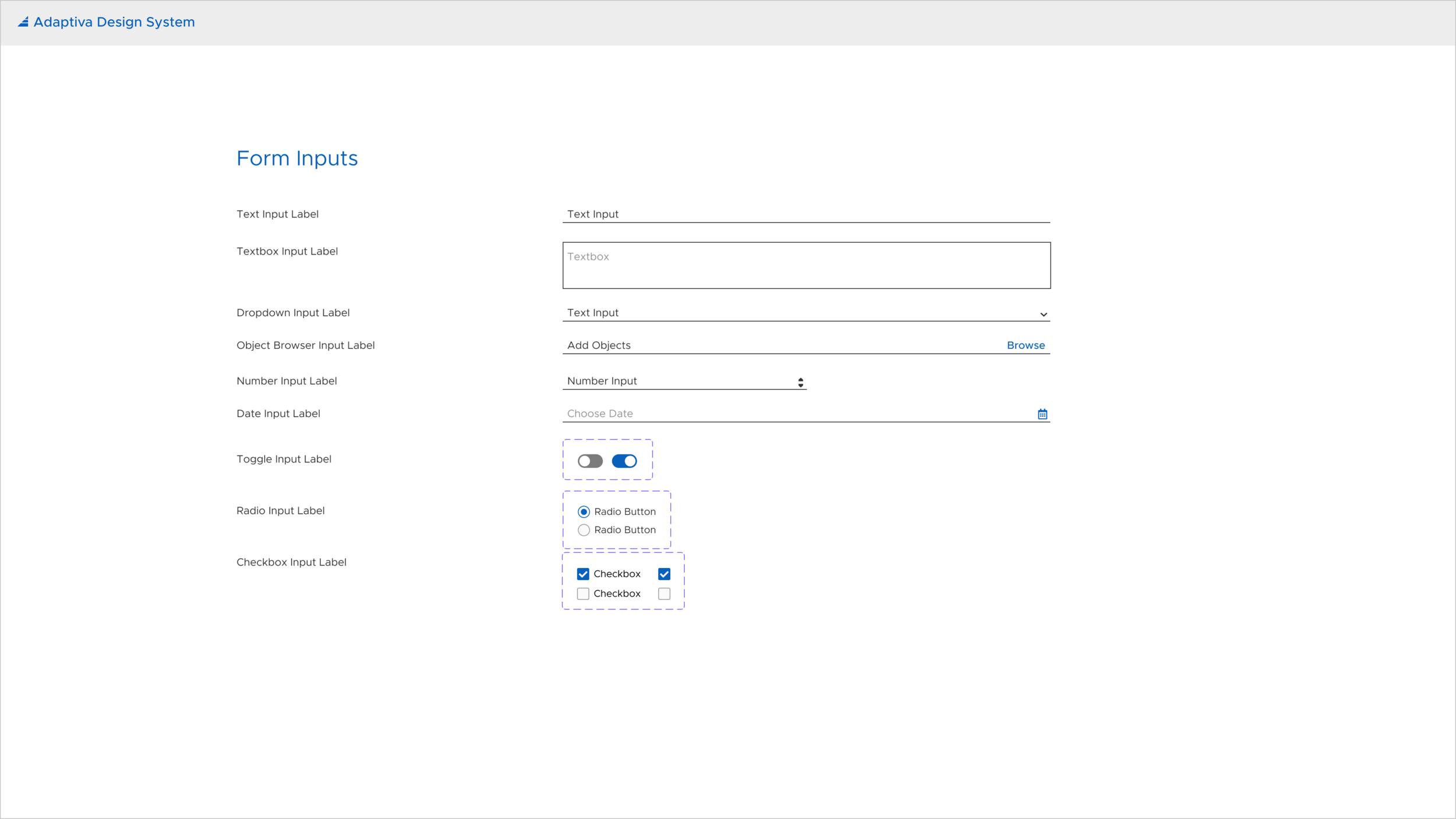
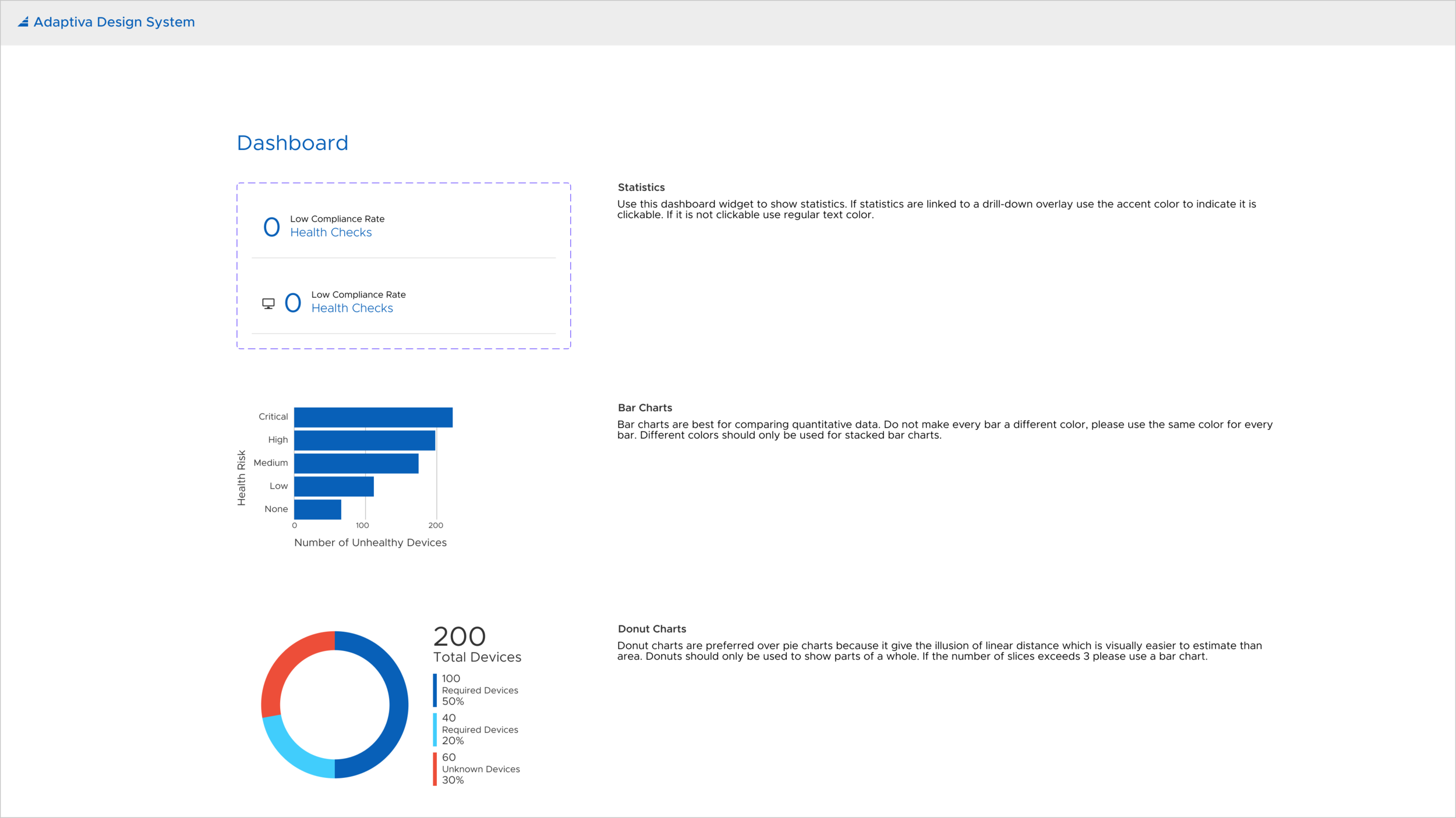
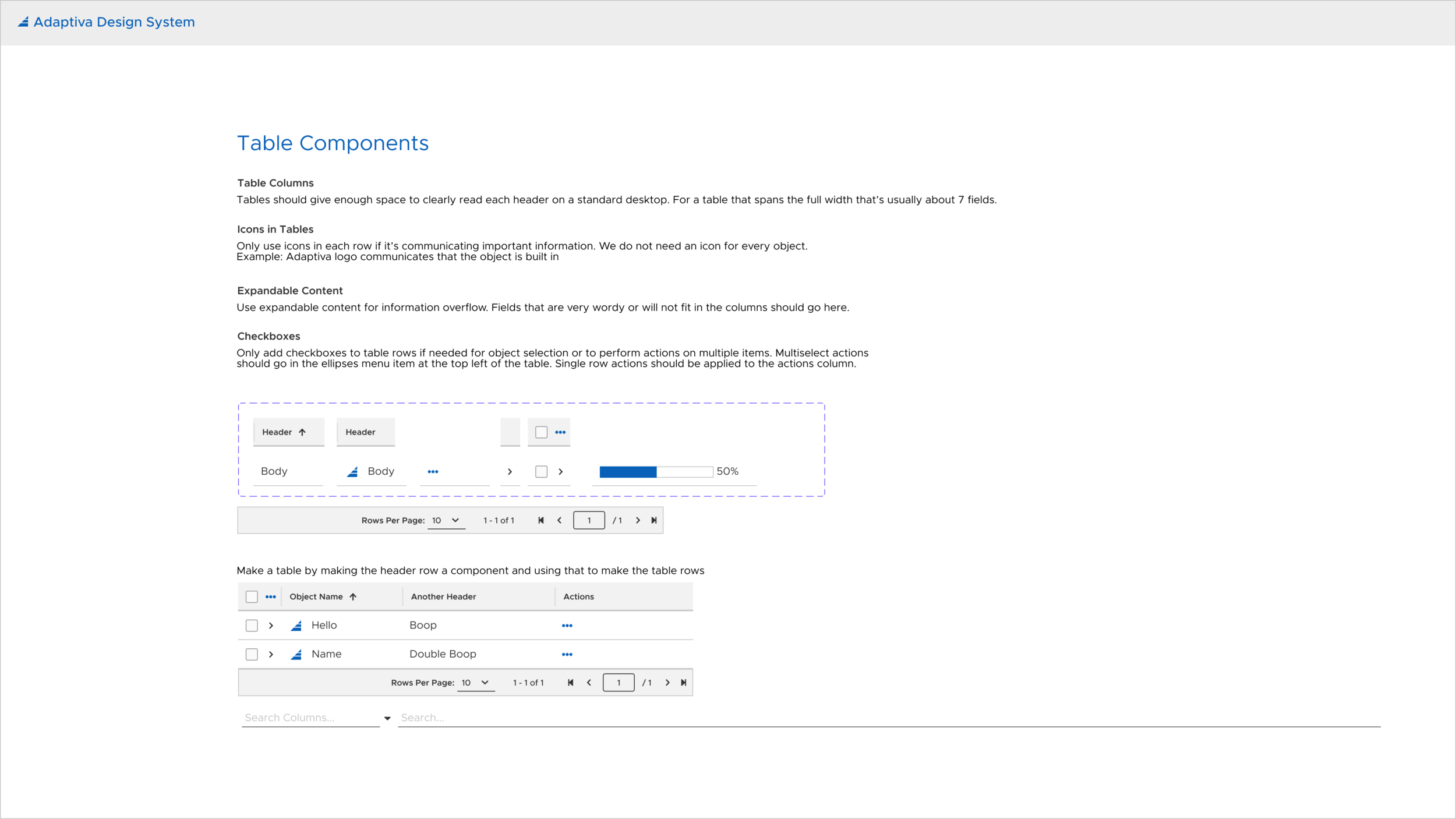
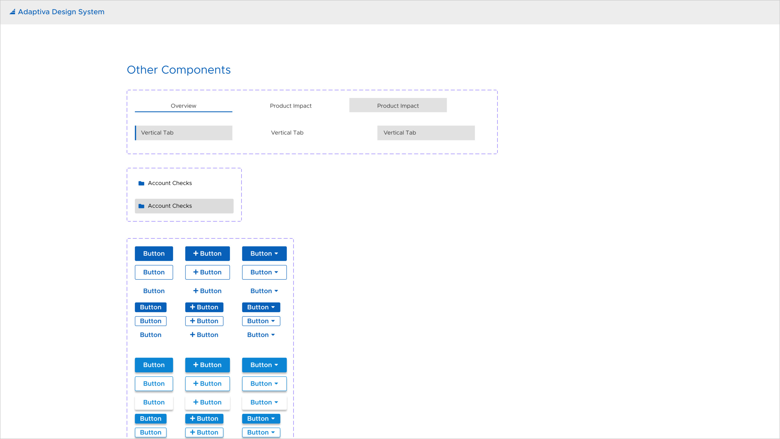
The style guide consists of everything needed to create an interactive prototype for Adaptiva products including colors, typography, icons, dashboard items, cards, buttons, form inputs, tabs, tables, menu items, and navigation components.
Common patterns
Many Adaptiva products have features with common user experience flows. To communicate design decisions effectively, I use these experience patterns when communicating with stakeholders and brainstorming ideas. These experiences include flows for browsers, editors, dashboards, and settings. Familiarity in similar experience flows improves the learnability of the products and overall platform.
Development of component library
The style guide and documentation of components informed handoff to engineers to code a reusable component library in Adaptiva's UX Designer, an internal Adaptiva tool to create screens. I worked with front engineers to ensure consistency with designs for this component library. To reference a few components see the above style guide. Below is a screenshot of the screen development tool.

